
Ultima started as an exercise. I’d been using Tailwind almost exclusively for the past few years, so I picked up StyleX, Meta’s compile-time styling library, to train myself on a different styling system.
That naturally turned into wanting a system around StyleX that worked for me and how I work. I wanted a reusable starting point for my own apps, and I liked shadcn’s source-ownership model. I could bring components into a project, understand how they worked, and change them when the project needed it. I wanted the same thing for StyleX, but shadcn’s components are built around Tailwind.
Once I started looking underneath those components, the work got bigger. A button already carries decisions about spacing, typography, color, borders, and interaction states. A collection of components also assumes that those decisions agree. The medium button should make sense beside the medium input. The same status should have the same meaning across the interface.
Existing tools had been supplying a lot of those choices. Building my own starting point meant deciding which ones to keep, which ones to change, and how they would fit together.
That became Ultima, a React design system built on Base UI’s unstyled components and styled with StyleX. Its 56 components install as source through a shadcn registry, and you own the code from there. I’m building it for my own projects, but I also want other people to be able to make it feel like theirs.
That second goal affects much more than the color picker.
A button carries more decisions than it seems
Take the Button component. Its API has three visual choices: variant, size, and tone. You can choose a solid, outline, or ghost button; a small, medium, or large size; and an accent or danger tone.
Those choices need definitions underneath them. What height is medium? How much space goes around the label? Which corner radius does it use? What happens to the background on hover? What color is the text against that background? How does keyboard focus appear?
There are also relationships to settle. Ultima uses the same spacing step for the height of a medium Button, Input, and Select, so medium means the same thing across all three. If each component picked its own comfortable-looking height, the difference would show up when someone put them together in a form.
The solid accent button reads separate tokens for its default, hover, and active backgrounds, plus a token for the foreground color. Its focus ring has its own role. Light and dark modes each need values for all of them.
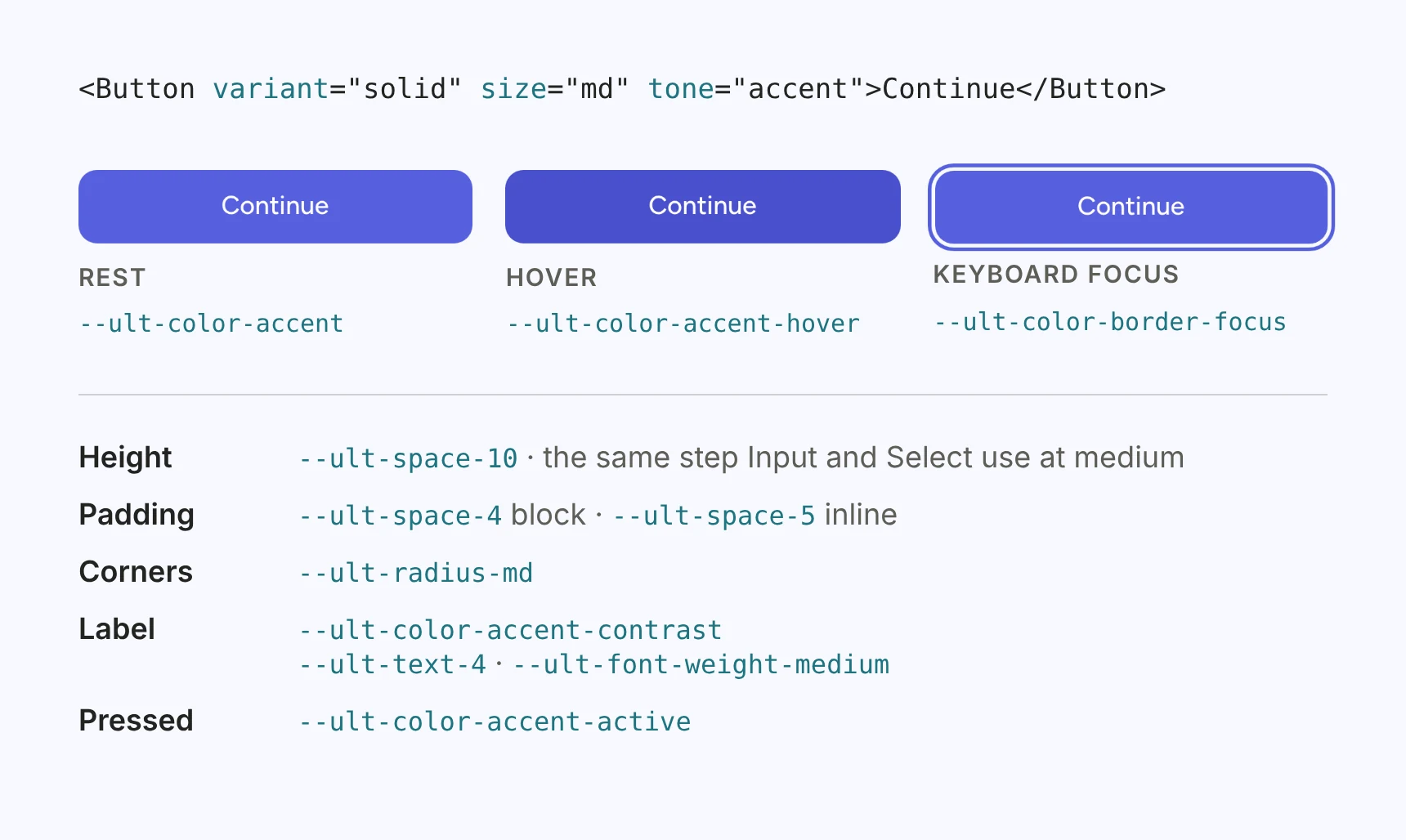
I want the next app to inherit those answers, so I can choose the appropriate button and spend my attention on what the action does, what users need to know before taking it, and what happens afterward.
Give the decisions names people can use
Once those choices are shared, their names become important.
A component needs to ask for the surface color, muted text, or an accent’s hover state. Naming those roles makes it possible to change the appearance while keeping the meaning of the component intact.
In Ultima, a token such as --ult-color-accent-hover keeps the same name across themes and color modes. Its value can change. Components keep referring to the same role.
Ultima keeps those semantic names as CSS custom properties, so a theme can override them from plain CSS or from a StyleX theme. Both routes change the same values. Here’s the Cinder preset’s dark accent, set each way:
[data-theme="dark"] {
  --ult-color-accent: #ea786a;
  --ult-color-accent-hover: #fc8779;
}
import * as stylex from '@stylexjs/stylex';
import { color } from '@/lib/tokens.stylex';
export const cinderDark = stylex.createTheme(color, {
'--ult-color-accent': '#ea786a',
'--ult-color-accent-hover': '#fc8779',
});The palette sits underneath that semantic layer. It provides the scales used to resolve the colors, while the component reads the role it needs. That separation gives a product a place to customize the system without searching through every component for a particular shade.
I also kept the names exposed to consumers conventional. Like mana, Ultima has a fantasy theme, and its palette scales are called mithril, arcane, mana, verdant, ember, and ruin. Someone using a component shouldn’t need to learn that vocabulary to find a text color or a border radius.
Stable names have a maintenance cost. If someone has written a theme against a token, renaming it can break their work. The names are part of the interface the system promises to support.
The same reasoning applies to component conventions. A small set of familiar prop names helps people carry what they learned from one component into another. Every additional variant or special case needs to justify the extra thing a consumer has to understand.
Leave room for a product’s own identity
A reusable starting point needs enough decisions to be useful. If every application has to invent its spacing, typography, and component states again, the system has handed over a lot of unfinished work.
It also needs room for the application to develop its own identity.
For Ultima, that means sharing the component structure and the roles behind its styling while making the visual values adjustable. A product can change its typography, density, corners, shadows, and motion alongside its colors. A dense interface with small corners and compact typography has a different character from one with more space, softer corners, and a more expressive typeface. Swapping an accent color leaves most of that untouched.
Those changes work through the shared scales. Density multiplies the 12 spacing steps that components share, from 0.75× for Compact to 1.25× for Roomy, so control heights change with it. Shape swaps the radius scale. That keeps the product from accumulating separate fixes for each button, input, and menu.
There are limits to what a theme should decide. It can change how a dialog looks. The product still needs to decide whether a dialog is appropriate for the workflow. It can give a danger action a recognizable treatment. The product still owns permissions, recovery, and the consequences of that action.
That boundary matters when evaluating a design system. A polished component gallery shows you part of what you’re adopting. You also need to understand which decisions the system carries and which ones your application will need to make.
Make customization something you can see
Theme Studio puts theme controls beside a live preview built from Ultima components. You can adjust color, typography, density, shape, elevation, and motion, then see how those changes work together.
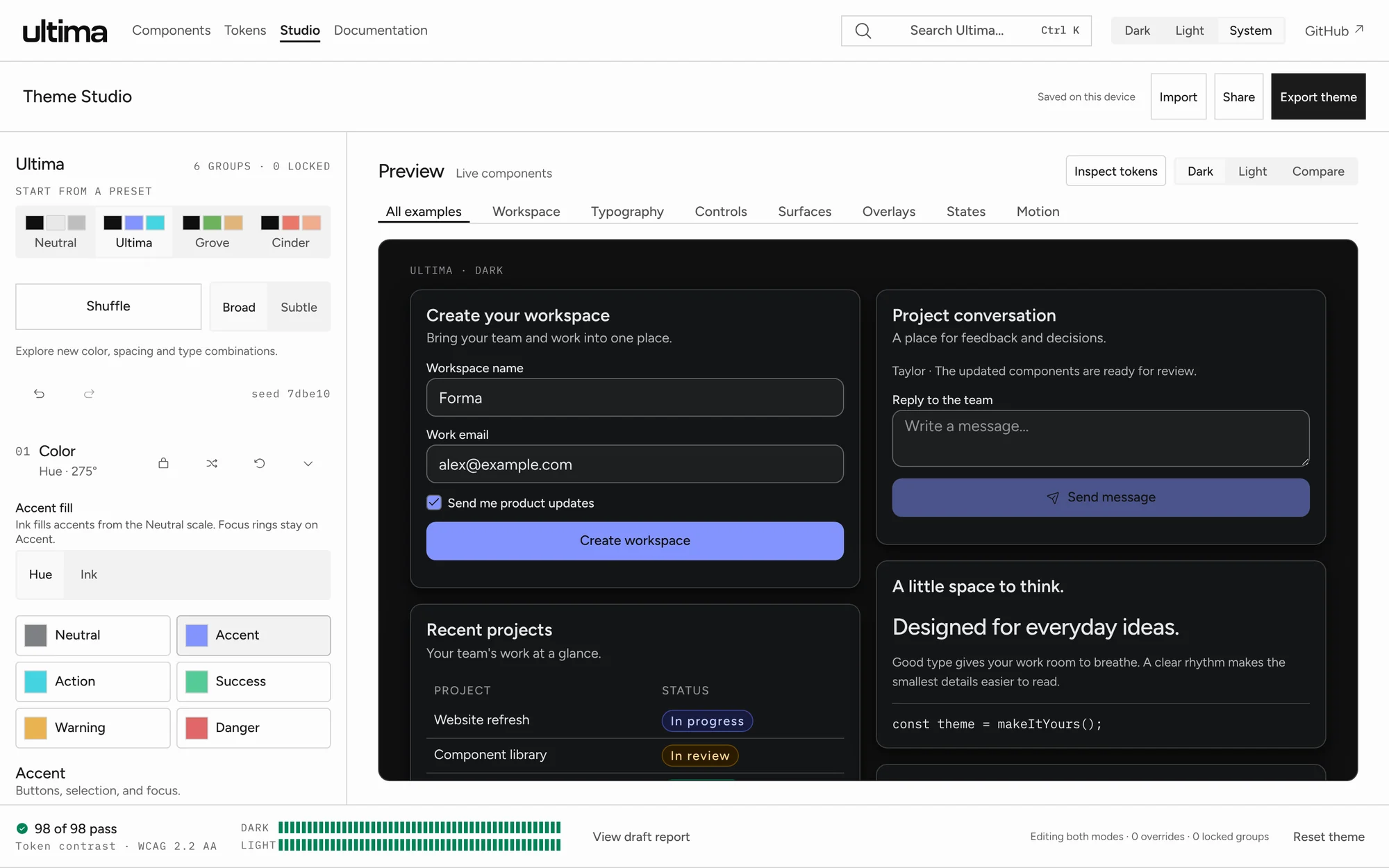
I wanted a way to evaluate the result in context. A color can look good in a swatch and be difficult to use for text or an interactive state. A type scale can look reasonable on its own and feel awkward when headings, labels, and controls share a screen. If a button starts to feel cramped after you change the type, you can adjust typography and density together.
The guided controls change both modes together, token overrides can set dark and light values separately, and the Compare view shows the two modes side by side.
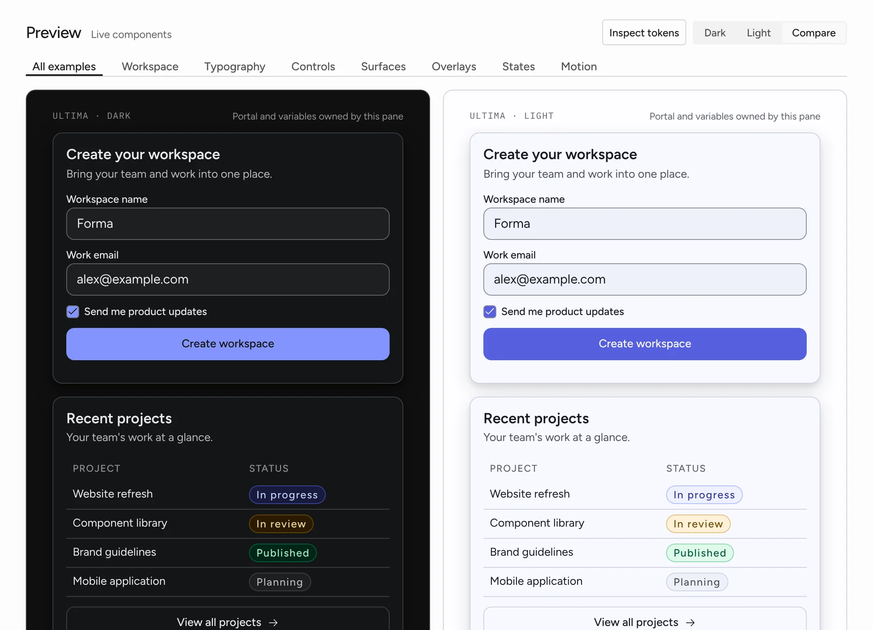
You can start from one of four presets or build a custom theme. Grove is green and earthy, with a serif and roomy spacing. Cinder is copper, compact, and sharp-cornered. Neutral is the achromatic default, and the Ultima preset keeps the original indigo and cyan look.
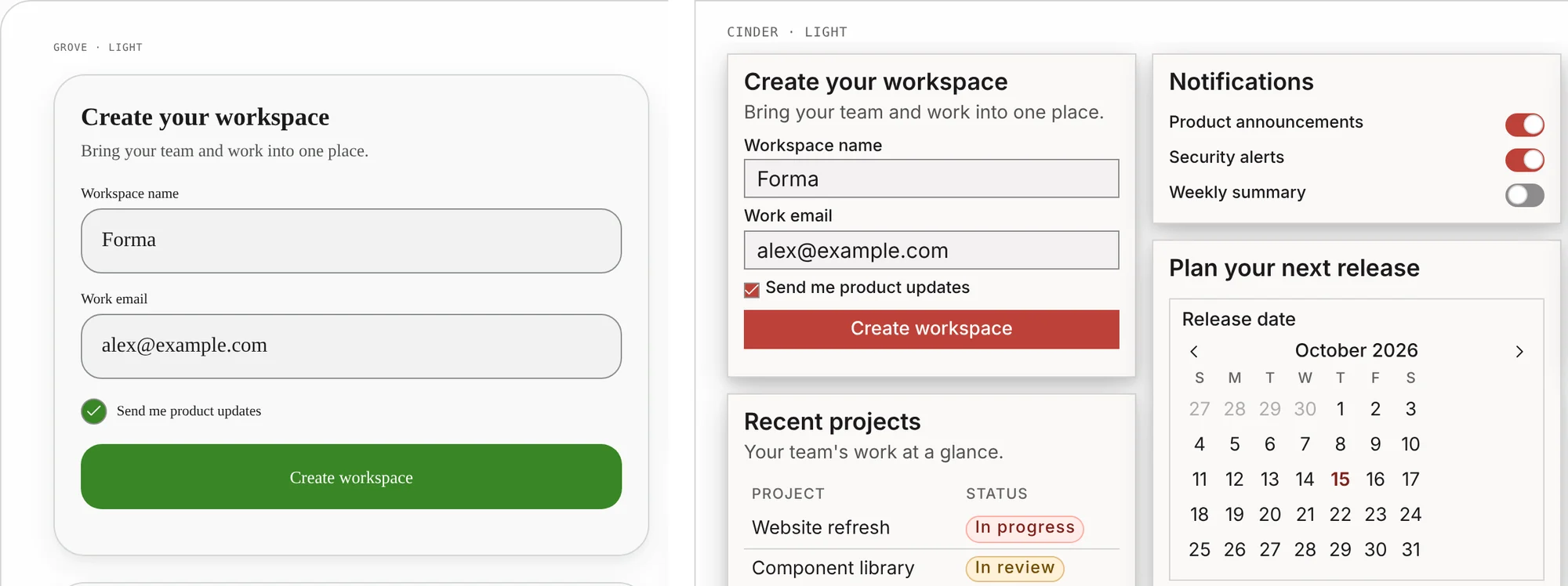
A shuffle control explores combinations. You can lock the groups you want to keep, like typography, shuffle the rest, and undo when a direction doesn’t work. When one value needs attention, a token override sets it directly, and it stays set when you adjust a broader control later.
The checks need a similarly clear scope. Studio checks 49 token pairings against WCAG 2.2 AA in each mode, 98 checks in all, and shows which ones fail. If your edits leave a pairing failing, Studio asks you to acknowledge that before it exports. Passing those checks still leaves the application’s accessibility to evaluate, including keyboard behavior, focus, labels, content, and the way components are combined.
For someone evaluating Ultima, Studio is also a way to answer a practical question before adopting it: can these components take on the visual character my product needs?
Make the preview and the exports agree
Theme Studio exports CSS, StyleX themes, an editable JSON draft, and a DESIGN.md that lists the resolved tokens for both modes, with short usage notes that point to Ultima’s component guidance. I wrote about why that kind of guidance matters in When anyone can generate UI, what is a design system for? Studio can also package the theme as a registry item for installation.
ultima-theme.json           the editable draft
ultima-theme.css            generated
ultima-theme.stylex.ts      generated
DESIGN.md                   generated
ultima-theme.registry.json  installs the CSS, the draft, and DESIGN.md
The preview and exports come from the same resolved draft. That connection matters: choosing a theme would be much less useful if the exported files represented a different set of values.
So I put the resolving in one function. resolveDraft takes a draft and returns every token value for dark and light, with any per-mode overrides applied. The Studio preview calls it, and so does each export. Color shuffle calls it too, and only applies a palette that passes every contrast check. The Ultima docs site resolves its own theme the same way.
Sharing a function still leaves room for drift, because each format gets compiled and loaded differently. A browser test covers that gap. It renders the preview for every preset, a shuffled draft, per-mode overrides, and a draft that fails contrast, then checks that the exported stylesheet and the compiled StyleX module produce the same computed values.
Drafts are versioned too. When a preset changes, Studio keeps the earlier revision resolvable, so a theme you saved before a preset update reopens with the values you saved.
Take the result into an application
The next step is getting that theme into a real project without rebuilding it by hand.
I’d keep the JSON draft with the project. It’s the editable source you can reopen when you want to revise the theme. The CSS and StyleX files are generated output. Hand-editing them is possible, but regenerating them can replace those edits.
There are still application details to handle, and the install guide walks through them. The stylesheet needs to be imported in the right order, or the StyleX themes applied at the appropriate boundary. A font stack declares the fonts you want; your application needs to load any face it doesn’t already have. Then you need to check the actual interface in light, dark, and system modes.
Project setup is a separate step. The ultima-design init command sets up a new Vite or Next.js App Router application, or adds Ultima to a supported existing one. It shows every file change before it writes anything. Yarn, Bun, workspaces, the Pages Router, and JavaScript-only projects still use the manual setup. Theme Studio handles the theme you’ll bring into that application.
The component source belongs to the consuming project. That makes local changes possible, and it also leaves the project responsible for understanding those changes when adopting later fixes. StyleX brings its own integration requirement: the application needs the compiler setup. Those are real costs to weigh against the convenience of the starting point.
If you try Ultima, I’d start with one representative screen. Use your actual content, put controls together, open the menus and dialogs, and review the states people will encounter. That will tell you more about the fit than a theme preview alone. Ultima’s Build a screen guide takes an empty Vite or Next.js app to one themed, responsive screen if you want a walkthrough.
The next application should be able to reuse the decisions Ultima carries and still feel like its own product. That’s what I’m building toward.
To try it, pick a theme in Theme Studio and set up a new app:
npx ultima-design@latest init my-app --framework viteThe install guide covers Next.js and existing projects, and the source is on GitHub.